 WAYLON: Visualizing A Song Into A Psychologic Piece Of Art Without Any Revisions
Leave a comment
THE CHALLENGE
How do you create a powerful single cover for one of the Netherlands’ most recognizable artists… in less than 48 hours?
That was the challenge when Waylon’s team called me in creative panic mode.
His new Dutch single needed an artwork and FAST.
The previous design wasn’t connecting. The deadline was brutal. And the release couldn’t be delayed.
So when Bibi Breijman reached out asking if I could help save the project, there was only one possible answer: Duh.
THE GOAL
This wasn’t just another music cover. This was Waylon’s first Dutch-language release, which made the visual identity emotionally important from the very start.
The artwork needed to capture multiple layers at once:
- the country influences,
- the cinematic atmosphere,
- the danceable energy,
- the emotional undertone,
- and Waylon’s own artistic personality.
All within one single image.
And because music artwork lives everywhere now, from Spotify thumbnails to social media and press coverage, the cover needed to instantly stand out while remaining visually iconic at every size.
No pressure…
THE CONCEPT
Whenever I work on branding or artwork projects, I never start with visuals first.
I start with psychology. Emotion. Meaning. Storytelling.
So before designing anything, I asked Waylon to complete my VisionForm: a creative deep-dive into the feeling, symbolism and emotional world behind the music.
Waylon already had strong visual instincts himself, which I absolutely LOVE in artists.
He described the song as:
danceable,
slightly cinematic,
with country influences and a subtle space-like atmosphere inspired by elements from the music video, including the iconic Knight Rider car.
Instead of creating one design direction, I pitched three completely different concepts:
• one based fully on his original vision
• one based on my own creative interpretation
• one more commercially positioned for mainstream audiences
And then something magical happened. They chose mine. Immediately.
THE VISUALS
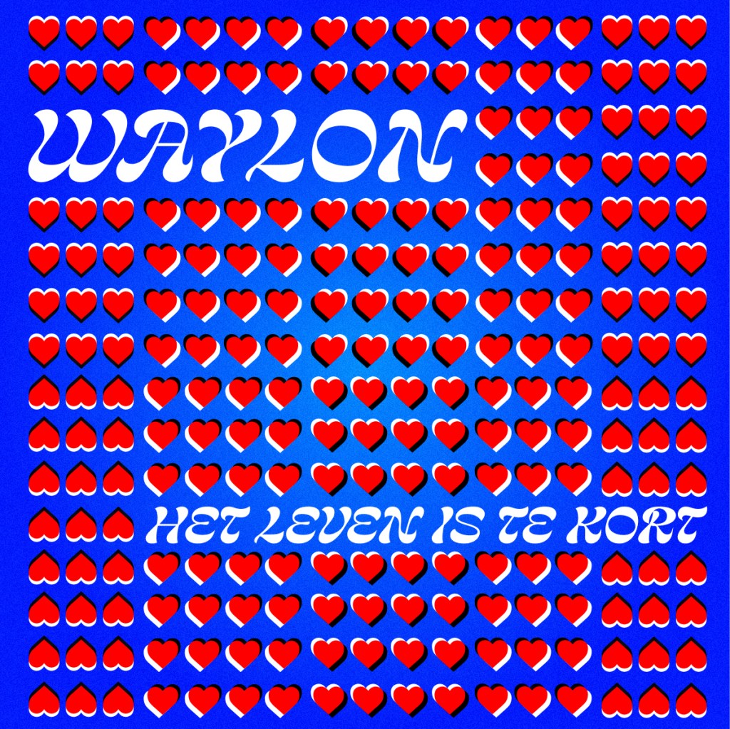
The final cover became a layered visual translation of the music itself. Every single detail had meaning.
- The red, white and blue color palette subtly symbolized Waylon’s first Dutch-language release.
- The typography carried a country-inspired aesthetic with a modern edge.
- And the most important detail: I created an optical illusion inside the artwork that made the static image feel like it was moving.
A visual representation of the rhythm and movement of the song itself.
When I explained the psychology and symbolism behind the design choices, Bibi literally got goosebumps. And Waylon’s response? “Don’t change a thing.”
THE RESULTS
The artwork was completed within 48 hours and approved immediately without revisions.
What started as a creative emergency turned into one of my favorite music branding projects to date. Because this project perfectly captures how I work: not just creating visuals, but translating emotion, personality and storytelling into design people can FEEL.
NEED A VISUAL THAT FEELS AS STRONG AS YOUR MUSIC?
From album artwork and campaign visuals to full creative direction:
I help artists, brands and productions translate emotion into unforgettable visuals.