 SPILNEWS: How I Turned Creative Chaos Into a Recognizable Brand Identity
Leave a comment
THE CHALLENGE
What happens when a fast-growing media platform has the ambition, the audience… but no clear visual system to support it? ChAoS!
Welcome to Spilnews
One of the youngest news platforms in the Netherlands, built for a new generation consuming news through social media first.
When I joined the team as a mix of Art Director and Graphic Designer, the situation was creatively stuck.
A large agency had previously developed the brand identity, but legal complications forced the platform to move away from it. A new Art Director was brought in to rebuild the visual identity, but the process remained unfinished.
The result?
An overwhelmed team.
Too many design directions.
Too many visual choices.
No clear consistency.
No scalable system.
And most importantly:
no recognizable visual identity people could instantly connect to online.

THE GOAL
Spilnews needed more than “good design.” It needed: clarity, recognition, consistency and a visual system the entire editorial team could actually use in real life.
Because journalists shouldn’t have to waste time guessing which template, color, font or layout they’re supposed to use while trying to publish fast-moving news content.
The visual identity needed to become: simple, scalable and instantly recognizable. Especially for a Gen Z audience scrolling at lightning speed.


THE CONCEPT
My approach was based on one simple philosophy:
Keep. It. Simple.
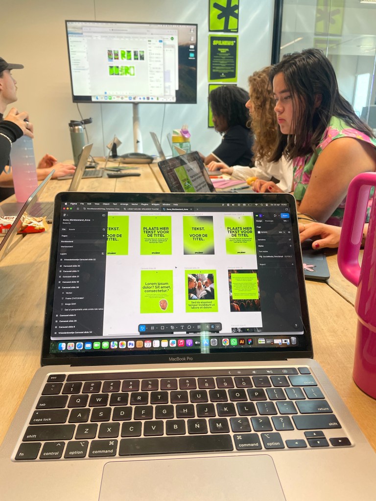
Instead of overcomplicating the identity even further, I stripped everything back to its strongest core elements.
- A simplified color palette.
- Clear visual hierarchy.
- Easy-to-use templates.
- Scalable social media systems.
- Recognizable typography.
- Fast workflows.
Every creative decision had one goal:
help the team move faster while strengthening brand recognition at the same time.
One of my favorite creative solutions? Turning the journalists themselves into part of the visual identity.
To make the brand feel more human, authentic and recognizable, we transformed the handwriting of the editorial team into custom fonts that became part of the content system itself.
Which immediately gave Spilnews something most news platforms completely lack: personality.


THE VISUALS
Within just two months, I helped create:
• a fully finalized brand identity system
• a practical and scalable brandbook
• social-first content templates
• recognizable thumbnail systems
• typography guidelines
• simplified creative workflows
• visual consistency across platforms
• custom handwritten fonts based on the editorial team
The result wasn’t just a better-looking brand. It became a system the entire company could finally build on.


THE RESULTS
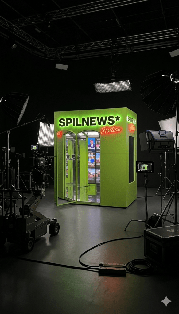
After months of creative uncertainty, Spilnews finally had a clear and usable visual direction.
The team could move faster. Content became more recognizable. The creative workflows became easier. And the visual identity finally started supporting the platform’s growth instead of slowing it down.
NEED A BRAND IDENTITY THAT ACTUALLY WORKS?
Whether you’re building a media platform, start-up, scale-up or cultural brand:
I help transform visual chaos into systems people instantly recognize, understand and remember.